Overview
BRIEF
Streamline the mortgage lending application process for borrowers engaging in the fix & flip market.
CLIENT
Elphi
A B2B, blockchain-based company streamlining the mortgage lifecycle from origination to securitization, using the leading DLT (Distributed Ledger Technology) protocol.
ROLE
Product Designer
Research, Information Architecture, Visual Re-design, Interaction, Testing
TEAM | UX/UI: 3 Product Designers
TIME | 4 Weeks
TOOLS | Sketch, Figma, Axure
The Problem
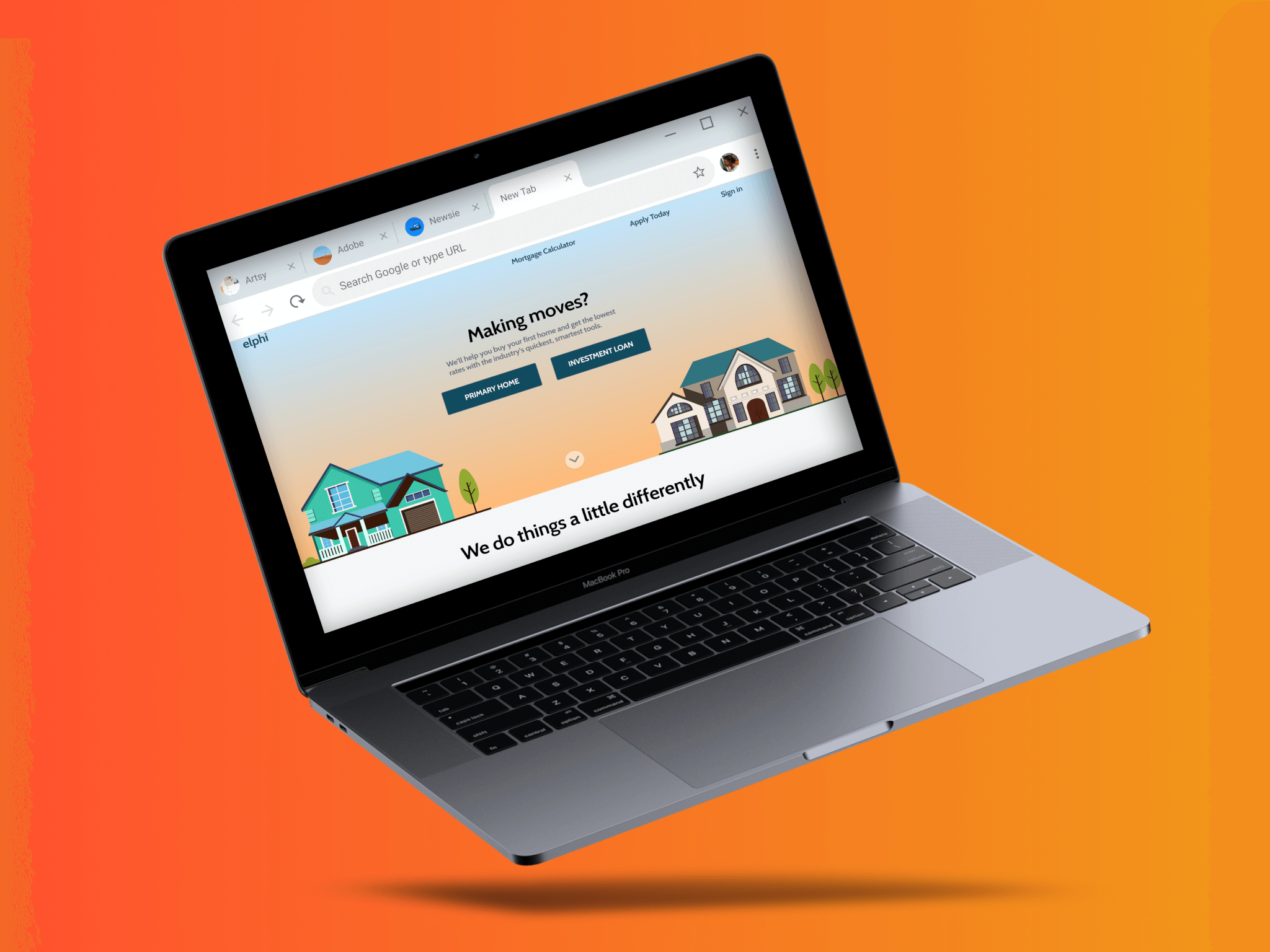
Elphi's technology has redefined the current mortgage application process, but they needed our help streamlining and redesigning the system and it's interface. Our results would help increase customer conversion upon bringing the technology platform to Merchant's Mortgage bank, a regional real-estate lender.

Our Challenge
Streamline Merchant’s current application experience by reorganizing content and redesigning the borrower-facing fix & flip application to be optimized with the Elphi platform. Make the process frictionless for the user.
Research & Discovery
Having no prior knowledge of the fix & flip real estate marketplace, we spoke to users and subject matter experts to understand the process at its core. We conducted design audits and usability tests of Merchant's current form in order to understand usability issues, and the barriers to starting and submitting online applications.
35%
of users actually finish the online application.
50%
of a loan processors time daily, is spent re-engaging with applicants to retrieve missing information.
Current State Audit
After evaluative testing, the following trends were noted as conversion barriers in the current Merchants form:
1 | Information Overload
The large amounts of required information is overwhelming for the average users.
2 | Redundancy & Disorganization
The same information is asked for more than once, and the information architecture is not intuitive.
3 | Data Privacy Concerns
Users are asked for personal information upfront.
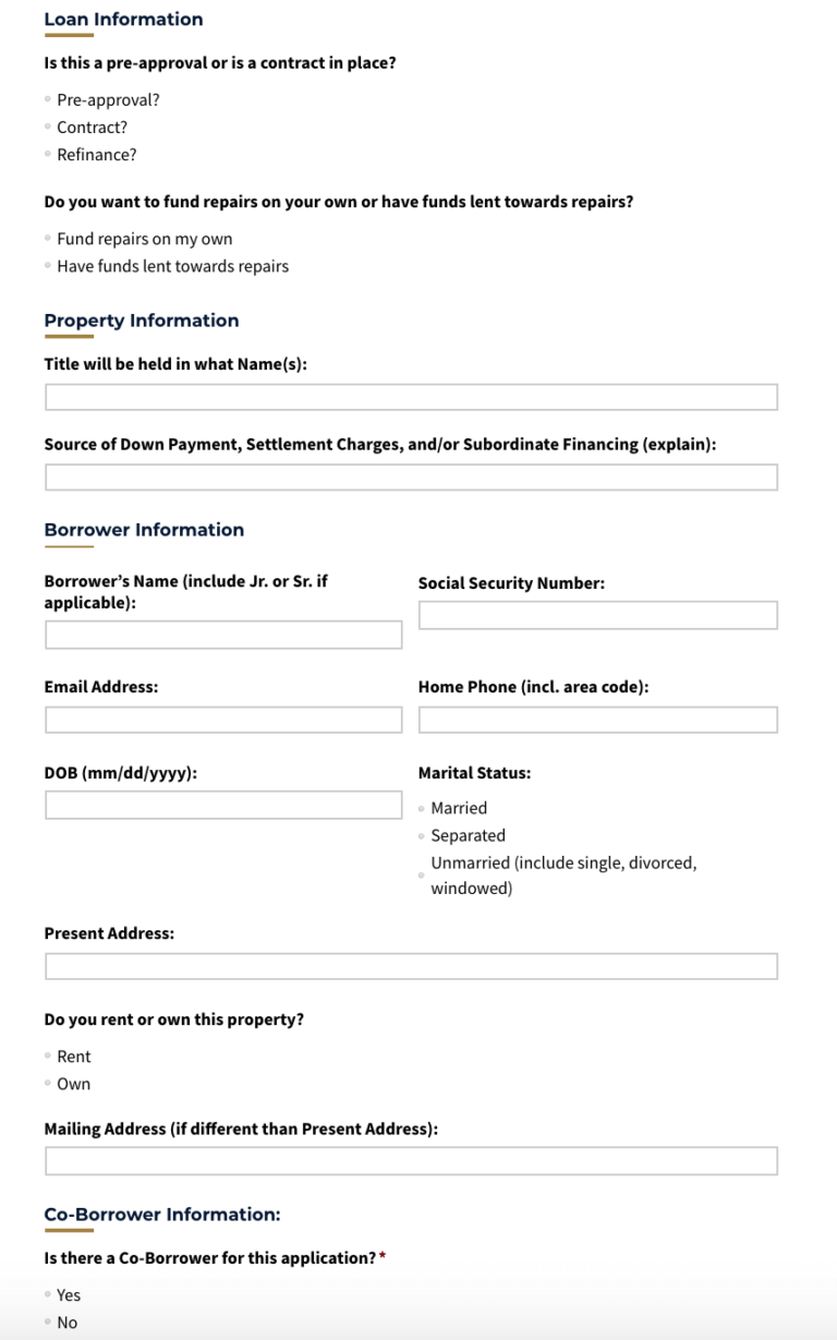
User is met by a "wall" of questions upon entering the application.
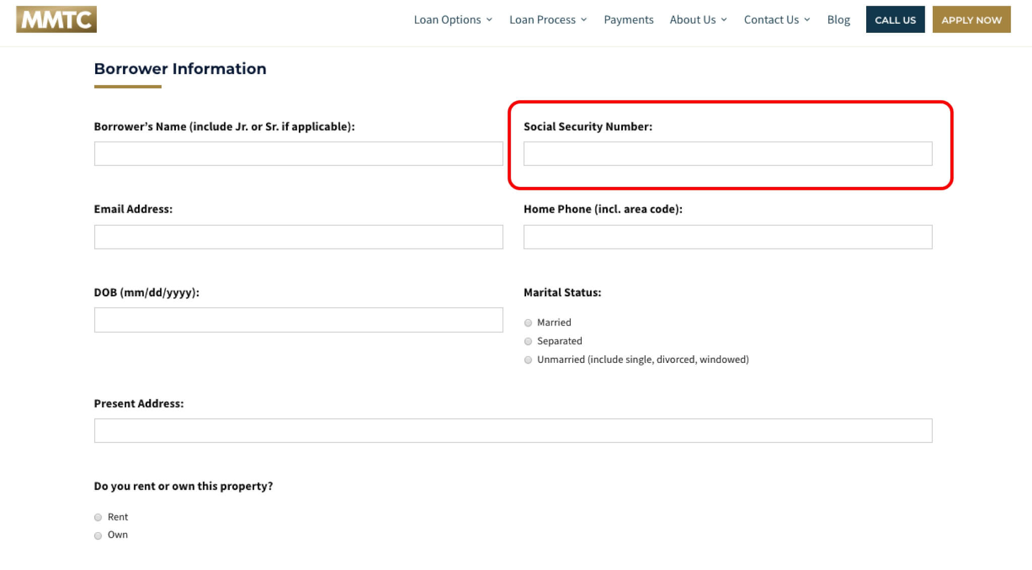
User is asked for their SSN on the first page of the form.
Competitor Audit
In order to understand what our competitors do successfully in the flip & flip market, we analyzed their platforms for common trends. They are as follows:
1 | Most competitors did not require registration as the first step.
2 | Loan/property information is asked before personal information and login.
3 | Progressive disclosure is used so that only information pertinent to the user is shown.
Opportunity
These observations led to a less daunting application process. We began ideating ways to similarly enhance Elphi’s platform, mitigating the experienced friction within Merchant's current platform.
Ideation
We developed several strategies that could exist within Elphi's current platform and aid in the efficiency of Merchant's application form.
01 | Implement Ease In Flow
To decrease overwhelm and avoid clutter, we found that an ease in process could guide users into the application process. We made use of progressive disclosure in order to retain users.
02 | Improve Information Architecture
To bring clarity to users within this complex space, we'd shorten the overall process to decrease the user's cognitive load. We needed to reorganize and regroup information categories so that they are intuitive.
03 | Address Personal Information
To enable users to feel secure with our system, we will not ask personal information at the beginning of the process. We will ask that users sign in before they are asked for private information.
Addressing User Flow
We addressed every question and category present on the current application form. We reorganized the information in ways that allowed us to break the system apart and dive into the absolute necessary questions of this process.
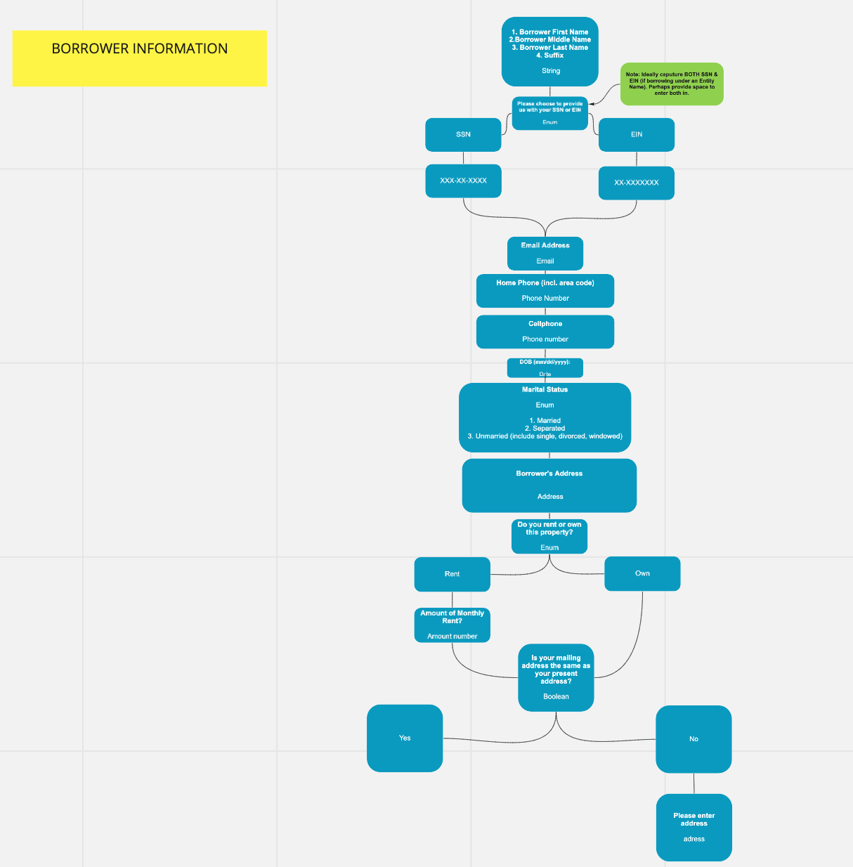
Borrower Information section of larger Miro board
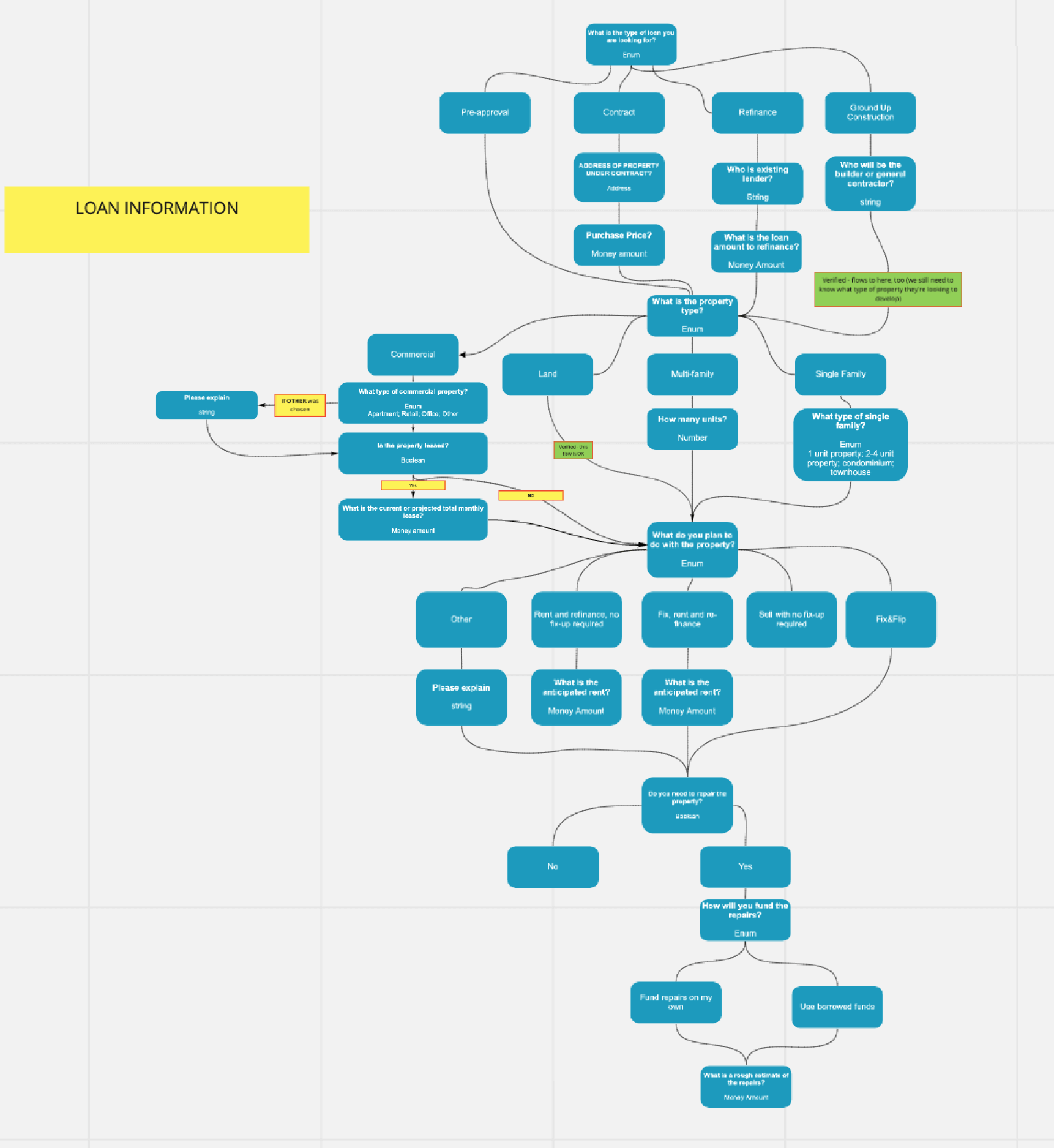
Loan Information section of larger Miro board
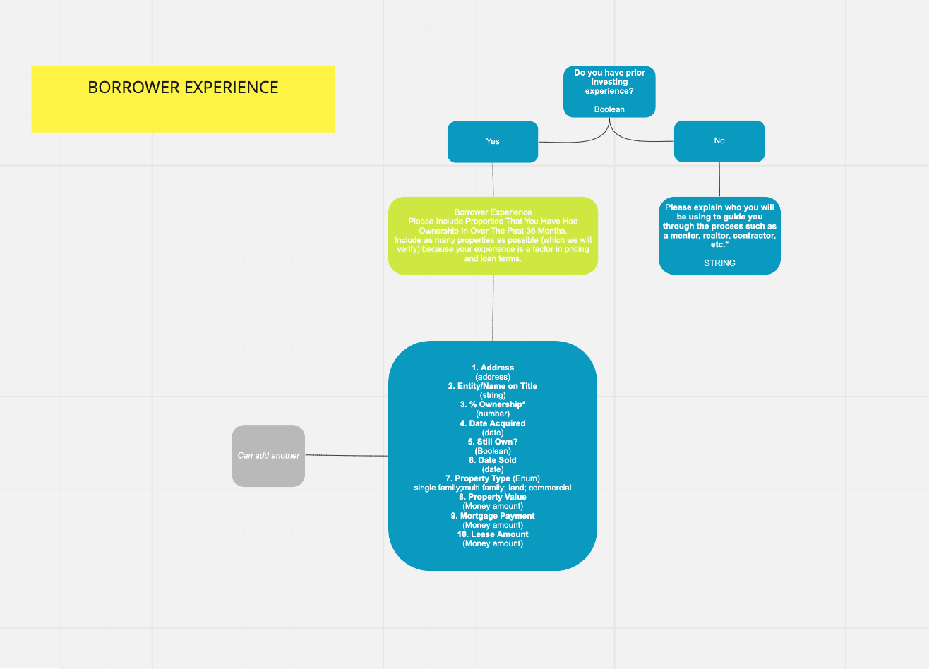
Borrower Experience section of larger Miro board
Concept Testing
We created exercises and prototypes to test with potential users, in order to validate the potential success of our concepts. We used card sorting methodology and A/B testing to gather insights. These exercises allowed us to test our concepts while learning more about the user’s mental model as they approach the application process.
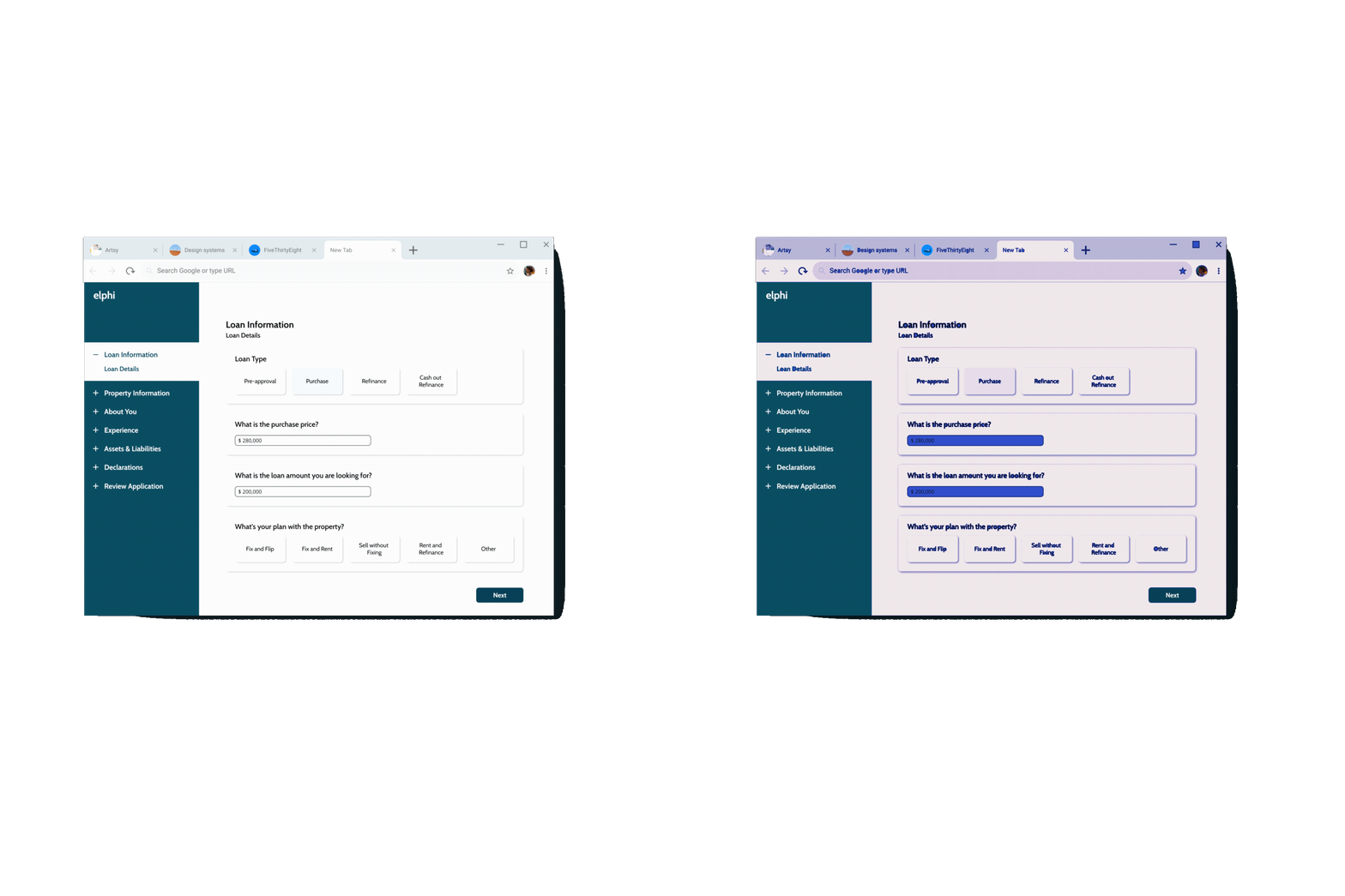
For the A/B tests, we quickly mocked up a few screens and ran 3 separate A/B tests. With the visual context presented to them, we are able to ask users which design they prefer.

Initial sketches of A/B tests.
For our card sorting exercise, we used Optimal Sort software to have users organize categorical information in ways that made the most sense to them.

Card sort results: The matrix shows what percentage of users categorized each question in the left-hand column into the categories shown at the top of the matrix
Strategy One
Ease in Flow
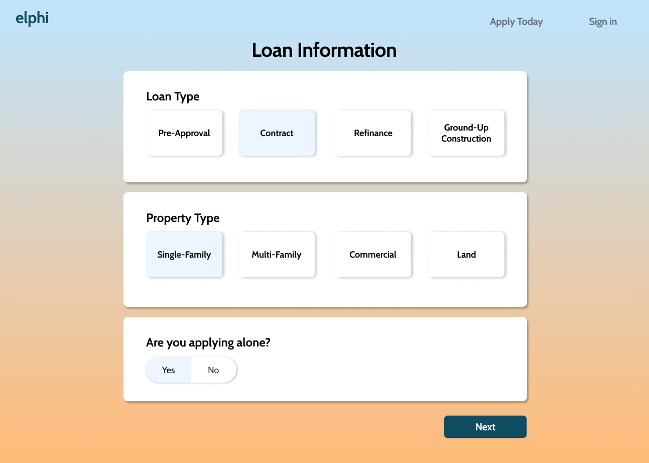
Test objective: Mitigate information overload and understand how users prefer to be visually and mentally introduced into the process.

Design A: Ease in flow shows one question at a time before the user gets to the next page
Design B: Ease in flow shows more than one question per page
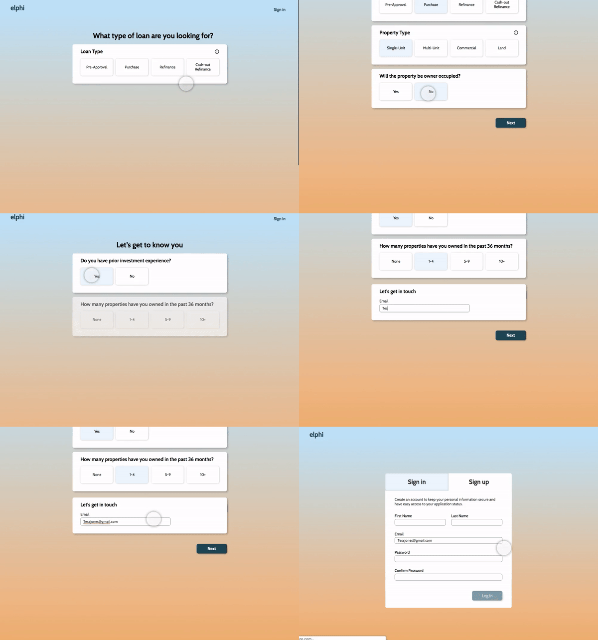
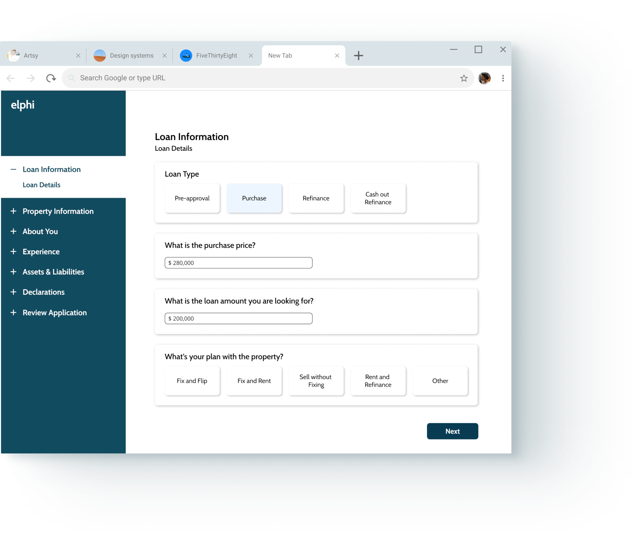
Results: The A/B test indicated users prefer a few simple questions regarding the property and loan to be asked before requiring them to sign in or sign up.
Strategy Two
Information Architecture
Test objective: Determine whether users preferred categories nested within one another, or remain as their own section in the left-hand navigation menu.
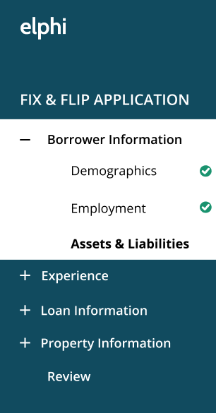
Design A: Borrower info category includes Employment, Demographic, and Assets & Liabilities.
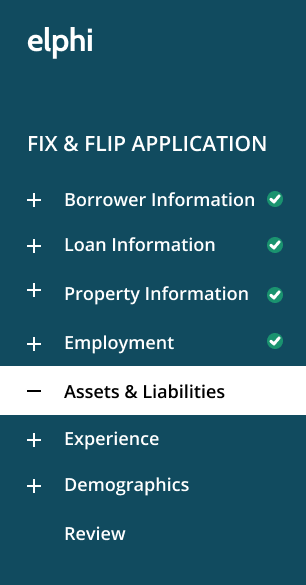
Design B: Categories are not nested within one another. Each exists independently of the other.
Results: Participants prefer to see form categories grouped together or nested within one another. On the original Merchant's form, “Borrower Demographic Information” lived separately from “Borrower Personal information”. We consolidated these sections in our final deliverable.
Strategy Three
Privacy Please
Test objective: Determine whether users prefer to give their personal information before inputting loan and property information or afterward.
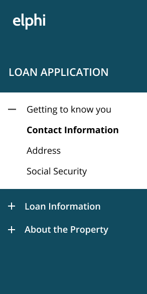
Design A: Personal Information is asked for before Loan and Property Information.
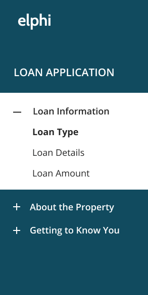
Design B: Personal Information is the last step in the application process.
Results: The user's expectations called for personal information to come before other sections in the form process. Based on our domain research, competitive analysis and stakeholder input, we chose to put the loan and property information sections before borrower information.
Usability Testing
We put our prototypes in front of users. Efficiency and user confidence were our main benchmark metrics, our results yielded overwhelmingly positive results. We had a 98% efficiency rating and a 96% confidence rating throughout the process.
Iterative Adjustments
Through testing with users, new opportunities were identified and the following adjustments were made to increase the platform’s usability.
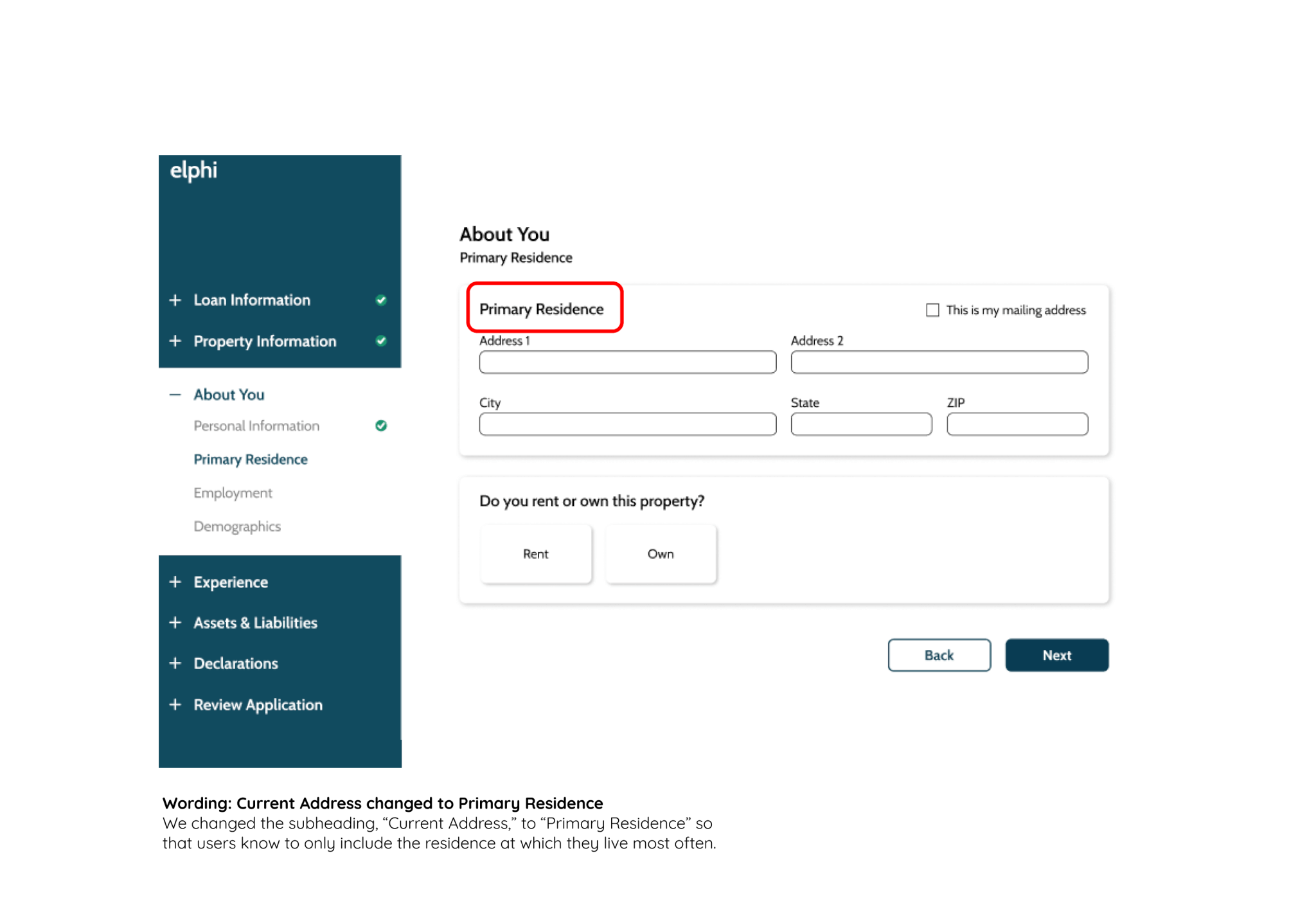
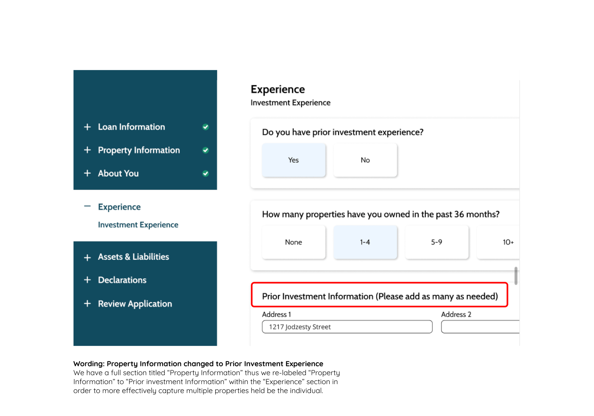

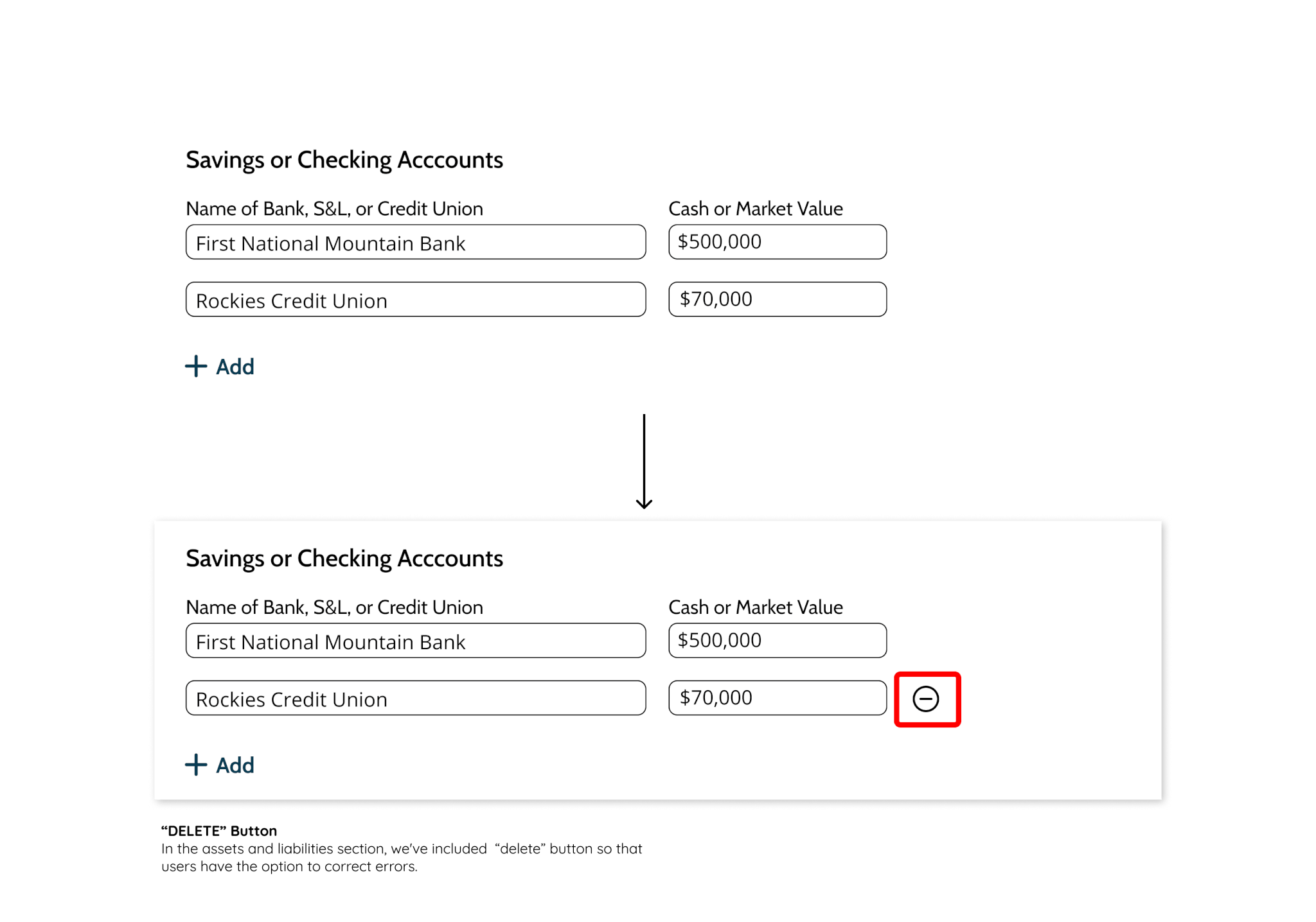
Iterative features
We have also included the following additional features that further increase the platform's overall usability.

1. Application saved indicator
The small flashing notification feature ensures users their answers are in fact saving.
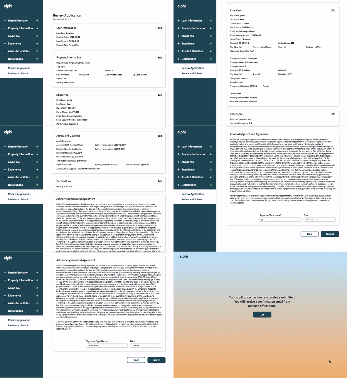
2. Final Review Page
Users needed to be able to review and adjust completed sections.
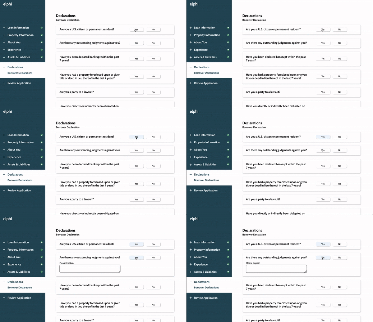
3. Declaration Explanation Field
We've incorporated progressive disclosure, only showing users an explanation field if their answer requires it.
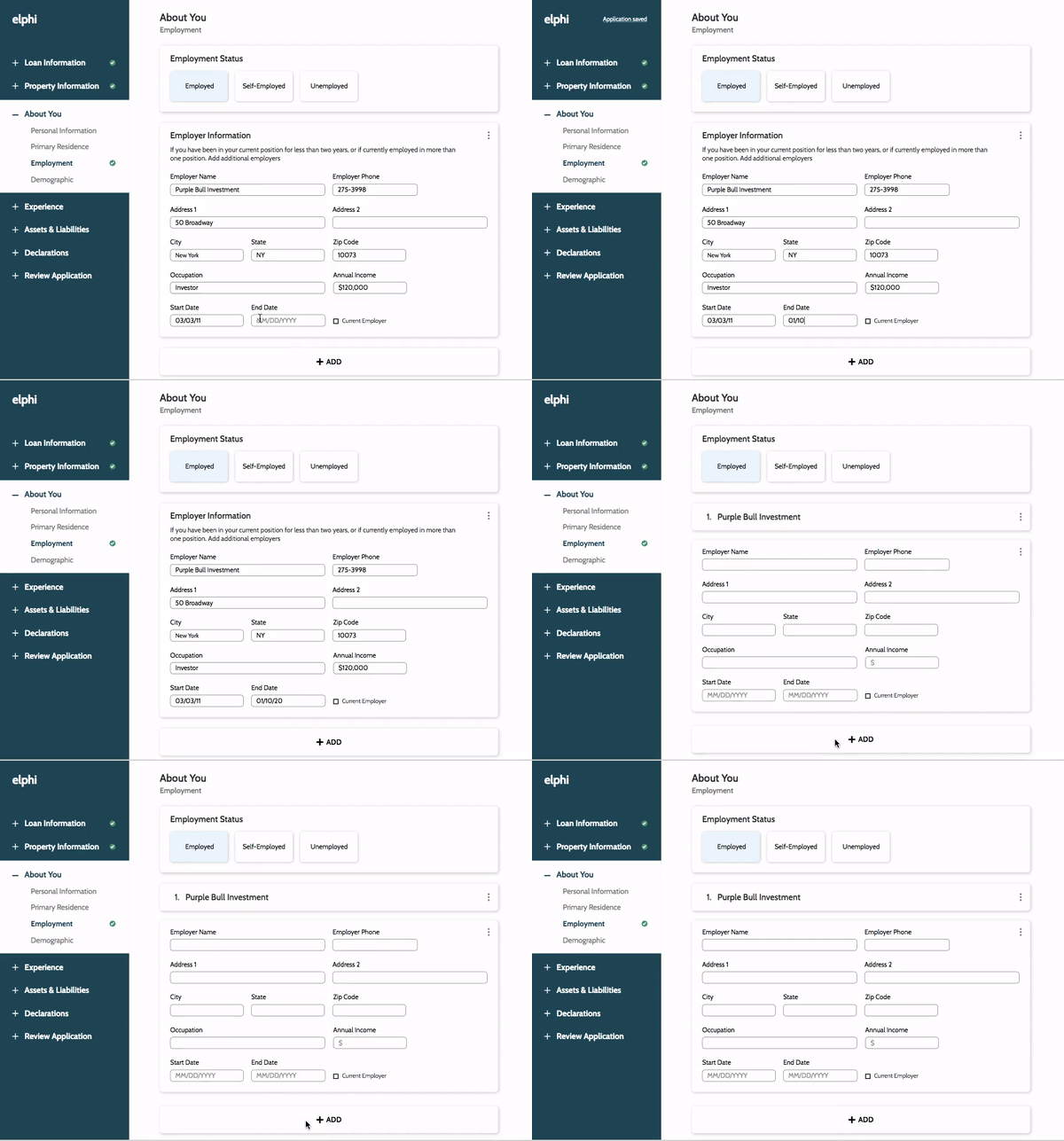
4. Collapsable Cards
Users can keep the interface clean by collapsing cards of information which have been filled previously.
Results
Our solutions addressed key pain points such as privacy concerns, information overload, and content disorganization. The additional features further increases the platform's overall usability. The final result was minimalistic, and intuitive. Our product allows users to feel confident, while also simplifying the process for loan officers and mortgage lenders.
So what did the client think?
“Phenomenal, incredible, we are actually going to implement this, you literally changed the company. I don’t know why we deserve that.”

EILON SHALEV, Elphi co-founder
Key Takeaways
1 | Trust your users, but also trust your instinct (if it is backed by research and data):
When it came to making key decisions about the platform, we needed to rely on the research we did in the competitive marketplace, and not just user expectations. Our user's expectations were in line with outdated models of technology platforms and we were ready to redefine those.
2 | Test early and often
We mocked up screens throughout the process to test existing concepts early and identify existing issues.
3 | Keep users informed
Reassure user's that their sensitive information is kept secure. Also give users visual cues into system status so they can feel confident in the platform.
